Canada
Hockey Canada
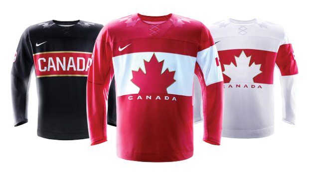
I don't know who gave the thumbs-up on these but I can only assume they were blind. No one seems to be excited to wear these, either. Canada used to look great because of the simple nature of their jerseys from 2010. This here is a case, like San Jose's recent update, where going too minimalist just ruins the whole concept. Like the USA jersey, Canada fell prey to glossy decorations on the shoulders where Canada features maple leaves flanking the neck on all three options. The red jersey is an exact inverse of the white jersey while the black third (why do they even have one of those??) just says "Canada" across the chest. All three also sport a single armband around the left bicep, which hasn't really been a popular design choice in about 70 years. All in all, this is just a bland concept with nothing in the way of a redeeming quality.
Verdict: Your jerseys are bad and you should feel bad!
Norway
Stanley Cup of Chowder
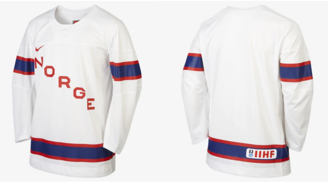
Here we have another team going with a simple set, except Norway opts for a more classic design rather than assaulting our sense of vision with a gamble gone bad. I should mention that this image isn't fully confirmed, but the folks at Stanley Cup of Chowder were tipped off to this design on a British Nike site. All other sources seem to confirm that this is the gist of it. The word "Norge" - Norwegian for "Norway" - crosses diagonally across the front and the striping stays simple and in line with their flag. The only improvement I would suggest is to incorporate their flag a little more (similar to what we will see with an eastern neighbor of theirs in a little bit) but otherwise this just works because it has for decades. Norway won't turn heads at the games with their play or their appearance but judging from some of the other entries that might not be a bad thing.
Verdict: Not earth-shattering but easy on the eyes
Austria
Stanley Cup of Chowder
This is a pretty clean design, once again very simple, but I give it the edge over Norway because they included the Austrian coat of arms. Austria did a great job incorporating their colours and the bands around the upper arms line up which is always a cool effect. The only thing that distracts from this look is the word "Austria" all glossed out across the chest. If you haven't noticed, I pretty much hate all of the stupid glossing Nike did for these jerseys. It would have been a nice touch if they went with "Osterreich", which translates to "Austria" in the country's native German. All things considered, still a solid submission from the Austrian team.
Verdict: That crest will strike fear into the hearts of men
Finland
Greg Wyshynski
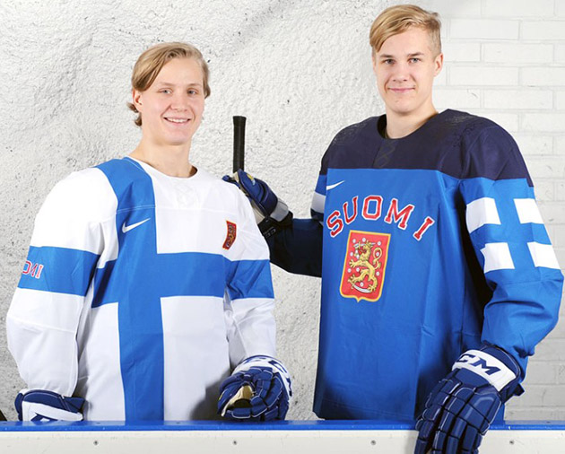
This may not be everyone's cup of tea but I'm a big fan of this pair. The white jersey is essentially a wearable Finnish flag, a trend that these Olympics has embraced rather prominently. The concept is unique and, in Finland's case, gives some life to a fairly neutral-coloured flag. The blue jersey is a good look for their colour option and finds a way to fly the flag, though in a more subtle way on the upper arm. While navy blue probably wouldn't be the first thing I would think of for the shoulder caps, making them a wash of the lighter blue would have been more boring, white would have been awkward, and apparently neon green was taken. "Suomi" - "Finland" in the native language - features in a different location on either sweater as does the country's coat of arms. If you're pale and blonde, you will look smashing in this outfit.
Verdict: Great flag integration Finnish-es this round up
Verdict: Great flag integration Finnish-es this round up


No comments:
Post a Comment