Switzerland

Stanley Cup of Chowder
Nike went with incorporating the main element of the Swiss flag, the white cross, and also went for a lot of...oh. Yea, that's all. Switzerland has never been a heavily decorated team when it comes to the outfit but this is just a practice jersey to boot. It actually looks like a sweater for a Nike+ beer league team. The only other element is the country name, Suisse in French, across either bicep. Well then. Moving along. Nothing to see here.
Verdict: Plus gets a big Minus
Sweden

Chris Creamer
Sweden kept things pretty classic here, going with the Tre Kroner as they are want to do. The sweater also features two blue stripes (yellow on their blue jersey) around the waist. However, Nike thought it was appropriate to remove the stripes they normally wear around the biceps as well as the highlight around the neck. This jersey isn't thoroughly terrible but once again we see something blinding us with its glare on the shoulders, viking ships in this case. That definitely knocks this one down a few notches and is just an unforgivable decision as a whole. I really hope this thing doesn't catch on because Sweden used to be among the best dressed on the international stage.
Verdict: Way to ruin a good thing, Nike
Latvia

Talk Hockey
Latvia's old sweater used to be pretty awesome, a little convoluted, but awesome nonetheless. For Sochi they kept a lot of the main elements - the arm stripes and "Latvija" across the waist - but scaled everything else back to just make it clean and uncluttered. The national crest in a monochromatic incarnation also makes an appearance on the chest, as it usually does. The white jersey, though I haven't seen an official look, runs a maroon shoulder cap as well. Chalk this up as a success because I'm afraid Latvia won't be seeing much on the ice.
Verdict: Introducing the business-casual hockey sweater
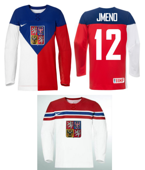
Czech Republic
Stanley Cup of Chowder
It takes a second, and awareness of international flag designs, to realise that the one on top isn't a dreaded franken-jersey but is in fact the Czech Repulic's flag. I've made it apparent that I support this look because of its uniqueness and some of the countries involved have cool schemes to work with. The thing that makes this a success is that the red wraps around from the left half of the front to the right armpit instead of landing symmetrically in the centre. Seems like a small detail to get excited about but it looks absolutely horrendous when done the wrong way. Their white jersey is nice and simple but does some creative work with the shoulder cap/striping along the upper chest. The coat of arms on both adds some great flavour on top of being a solid crest to begin with. I like how the Czech white is similar yet distinguishable to the Slovakian one since the two countries used to go out or something. Good work all around for the Czech team.
Verdict: Czech men are alllllll shoulders, ladies
No comments:
Post a Comment