Slovenia

Realismadder, Wikimedia Commons User
Red, white, and blue are featured to an almost nauseating degree in this year's Olympics, as we will soon find out, so Slovenia decided upon a departure from those, which are also their national colours. The substitution? Neon green a la the Seattle Seahawks. Both their home and away looks boast the jagged mountain cliffs and inverted triangle of stars featured on the crest of their flag, but the nontraditional shade of green is a little jarring. Hockey is not usually the type of sport to be risky with colour schemes so I applaud the attempt here. However, I can't for the life of me formulate an answer to the question "why THAT colour?" Aside from that, it's a fairly simple design with the angles around the waist being a nice touch. I would give the edge to the white home jersey as being my favourite, but I can't see myself paying more attention to their play on the ice because of how mind-boggling the look is.
Verdict: Explain what I'm looking at please?
United States of America
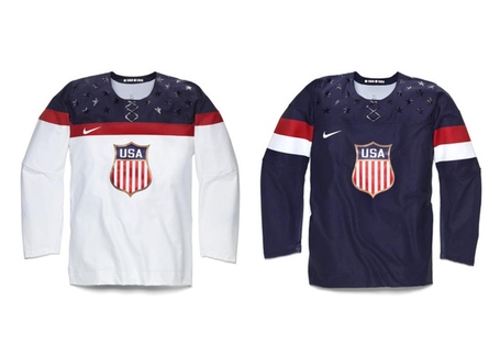
sbnation.com
I don't even think I have to explain why this jersey was ruined. It's those stupid f***ing stars on the shoulder yokes. Everyone has the insufferable fake laces that you can clearly see so I'll just ignore that atrocious design decision as much as possible but seriously why did you put those stars on there, Nike? Either home or away are perfectly mediocre to begin with but the cute decals around the neckline are making me embarrassed to see my home country take the ice. The crest is pretty slick, despite looking a little like the USDA Prime Beef logo, but the overall result is thoroughly underwhelming. You took a big step back, US of A, and it will be a while before anyone is this excited about suiting up for the stars and stripes.
Verdict: Only a Gold Medal will forgive this abomination
Slovakia
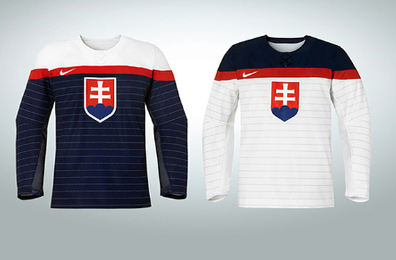
Chris Creamer
This here is nice and simple. The designers at Nike clearly didn't want to work too hard, which would explain why the white for Slovakia and the USA are essentially carbon copies of each other. The pinstriping is a cool effect and, if you take a closer look, is actually the Slovakian national anthem. The crest was taken straight from their flag and there is no superfluous accents around the shoulders so they didn't do anything to make this design any worse. Again, pretty underwhelming but there really isn't anything to hate about the look aside from Nike's complete lack of an attempt at originality and identity.
Verdict: Unmemorable, but it could be worse
Russia

Sir Lucas Leftfoot
You would have to think that, as the host-country, Russia would come out looking spiffy and they sure delivered. I will be crapping all over Nike for appearing to derive all of the twelve teams' appearances from what seems to be the same two or three templates, but what they did create for the home club was purely unique. Both looks feature the word "Russia" in the native tongue as well as the nation's coat of arms - the crowned two-headed eagle - but the white jersey seen on the left takes a bolder approach by integrating it into the negative space. The white also sports a set of wings on top of the shoulders which makes for a neat addition. To cap things off, they placed four gold stars on either shoulder of the red jersey as well as eight gold crowns on the right forearm of the white jersey to signify Russia's success in the history of Olympic competition. I give both looks a SuperPass.
Verdict: Everyone go home, these jerseys beat your team
No comments:
Post a Comment