We can argue day and night over whether bringing the outdoor festivities to more fans is a positive move or if it cheapens the novelty and spectacle of the idea but I think one thing we can all agree on is the excitement over the new swag rolled out by each team involved.
While most teams employ forward-thinking third jerseys for a handful of home games each year, the Winter Classic and Heritage Classic typically gives us the opportunity to honour tradition. In the past, the combatants have dug deep into their respective histories, crafting memorable pieces as unique as the event itself.
With the Stadium Series set for its inaugural year, the NHL has sought for a different take to the outdoor sweater. Well, the results are in (except you, New Jersey) so let's put each team's work up against each other for each event, bust out our patented rating system, and find out who would win if the teams played 60 minutes of fabulous.
Winter Classic - Toronto Maple Leafs vs. Detroit Red Wings January 1, 2014
Paul Sancya, AP
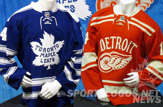
Toronto has been an NHL organisation since 1917 but it wasn't until Conn Smythe purchased the the team in the middle of the 1926-27 season when the team took the name we all recognise today. The logo in their Winter Classic uniform is the original, which was adopted after they abandoned the "St. Pats" moniker. The striping on the arms and waist also made their debut in 1927-28 but the shoulder caps suggest that this design is officially based on the uniforms won from 1930 to 1934.
The only discrepancy from the jersey this is based off of is the style of the numbers. The Maple Leafs didn't stitch numbers on the sleeves until 1962 but then again this is the convention we see today so this isn't too jarring. However, the numbers themselves are the blocky incarnation of their current jerseys. The 1930 variation featured blue numbers with white outlines. This was a missed opportunity for the team since the classic detail would have been more complimentary to the striping but, on the flip side, it could have made the look a little too busy.
Verdict: Classic but a little hectic
The Detroit uniform is a fun one because, while it isn't a direct replica of an older sweater, the designers took some liberties with classic elements. The lettering and the numbering on this piece are in the style of the 1982-83 version, which is when the Red Wings included the vertical arch that we see with 'Detroit' here as well as the nameplates ever since. The logo itself is the original Winged Wheel design which was adopted when James Norris purchased the Detroit Falcons franchise in 1932 and dubbed the team the Red Wings. This crest, which was worn from 1932 through 1948, is similar to the current incarnation except it lacks the sleeker, "in-motion" appearance that followed.
As for the striping, this is where the designers decided to play with things a little instead of outright borrowing. Since 1932, the Red Wings haven't done much on their sweaters instead of a single wide stripe around each arm and a single wide stripe around the waist. The design we see here is more reminiscent of the 1927-28 Detroit Cougars jersey. The double striping across the chest and lower torso, while not exact, mirrors that of the original Cougars. The Cougars also employed three stripes of varying width on the arms but this feature has been pared down to one thick and one thin in the Winter Classic version with the numbers on the shoulders.
Verdict: Detroit - Bankrupt in Business but not in Style
Winner: Detroit
Stadium Series Game 1 - Anaheim Ducks vs. Los Angeles Kings January 25th, 2014

ducks.nhl.com
Just...wow. The Anaheim Ducks have had an interesting history with jerseys, centering around the colours eggplant and jade from their inception in 1993 through mid-2006, when they dropped the "Mighty" from their name, and also bringing us this delight in 1995-96. One would think in their 20th anniversary, even though the old jerseys have made an appearance on home ice, they would work some sort of throwback magic. Instead, they decided to go full orange. Even the Philadelphia Flyers know you never go full orange.
The most jarring aspect about this sweater is that the Anaheim Ducks feature orange the least out of any other colour on their normal jersey. It's actually just a thin stripe that wouldn't show up on screen unless you have a 110' plasma television that pumps out 4K resolution.
Lost in this carrot costume are gold, white, and black stripes around the elbows but that's pretty much the only decoration we see here. Seriously if the Ducks weren't good at playing hockey, attendants to Dodger's Stadium might think they were watching a Kings' outdoor practice, complete with full-size cones.
Verdict: I never thought my eyes could vomit until now

kings.nhl.com
I'm not head-over-heels in love with this sweater since nothing really grabs my attention about it, but at least it is moving in the right direction. The Los Angeles Kings worked gray into their colour scheme in 1988 and haven't looked back since. While that has been the case, gray has never been featured so prominently and yet it ain't too shabby a look.
To start, I hope you are starting notice the glossy chrome look with the logo on the chest because you are going to be seeing a lot of it for the Stadium Series. The crown itself is the iteration the organisation hinted at in the 1998-99 crest as well as the one unveiled in full detail on their third jerseys of the time in 1999-2000 and still utilised today.
Another thing you can expect to see almost normalised for the Series is the pointed shoulder caps. Each team that actually uses them will have their different colours and logo but the design itself seems to have won the NHL over. One feature that I think the Kings hit out of the park here is the striping on the arms and around the waist. The design itself isn't extremely complicated but if Mr. Dustin Brown had his arms at his side you would see that the stripes transition seamlessly from one body part to the next. It's a nice touch for a jersey that will be worn once and something you don't see many teams doing.
Verdict: Interesting Idea, Boring Execution
Winner: Los Angeles, by a mile of heavy traffic on the 405.
Stadium Series Game 3 - New York Islanders vs. New York Rangers - January 29, 2014

islanders.nhl.com
Holy Christ is that a clean look. The Islanders have had the same logo since they debuted in the NHL in 1972 (*cough* ahem *cough*) but here we see it stripped down to its most basic, recogniseable element with the chrome slapped on to accent.
The nice thing about this sweater is that they didn't do much to alter the classic appearance of the uniform but what they did do made it sharper. The shoulder caps, which are essentially the same as the caps on the Kings uniform, make a rare showing for the Isles and the white integrates well here. They ditched the orange stripe around the waist but thinned the white stripe out, a subtle yet effective change. Last but not least, they angled the stripes around the elbows down but kept the orange and white scheme used today. All in all, this is just a great example of less is more in a one-time-use jersey.
Verdict: The Isles CAN do something right every once in a while

New York Rangers via news.sportslogos.net
Work it, Dan Girardi!
The New York Rangers are a team that has done very little to change their uniform since they entered the league in 1926, which is why they are one of the few to aptly maintain a classic look. For 50 seasons, the team has featured the word "Rangers" running diagonally from the right shoulder to the left hip on the front of their sweater, save for the 1946-47 season in which they adapted an arched format. For the following two seasons, the team sported the crest that, today, we acknowledge as their official logo yet hasn't been featured as prominently on their sweater since. Between the years of 1978 through 1987, the Rangers would alter things a bit, running the city name across the front in the same manner as "Rangers" except only on their away jersey which, at the time, was the blue as opposed to white.
The numbers here are inspired by the white alternate jersey worn during the 1998-99 season. The main colour is navy blue (the standard alternate jersey hue of blue for the team between 1996 through 2007) but instead of a thin white outline between the number and a red drop shadow, they chose to flip the roles of those colours by making a red outline around a white drop shadow. The stripes around the elbows, alternating blue, white, red, white, and blue, has been a standard of the team since they introduced a white sweater in 1951. The main subtraction to this jersey is the striping around the waist as well as at the bottom of the shoulder caps, which are all but certain to be the same on the majority of Stadium Series looks by now. As far as additions go, the big thing that we haven't seen the Rangers do is run a swath of blue up the sides of the torso and down the arms.
Verdict: Decent take on a Historically Consistent Sweater
Winner: New York Islanders
No comments:
Post a Comment